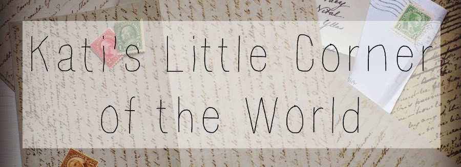
I have been wanting to change this space of mine for a while now. I liked envelope header and my pale blue background but I was ready for something new.
~background color
I love the look of a blog with a white background. It feels so fresh and I find it easier to work with.
~header
Even though the envelope said me, I didn't like that it didn't go all the way across the top. So instead of creating a whole new longer envelope, I went with a slightly different look with a pile of letters, stamps, and envelopes.
~Photo Friday button
Because I changed my background to white, my old button blended in too much so I started from scratch to come up with this.
~favicon
While I was on a roll I changed my favicon to a "K" instead of a dandelion you could hardly see.
~a few other little changes
-different fonts for post titles and sidebar titles
-all blue accents (sides, dividers, links)
So, what do you think?


5 comments:
I do like your changes very much, especially the Photo Friday link. I do love a hydrangea! But... What is a favicon?
Thanks Joanne! A favicon is the little picture that shows up at the top in your tab next to the page name. It is acting really slow though so it's still the old one. Hopefully the new one will be up soon.
It looks great, Kati!! I really like it, especially the header. It is definitely unique and very pretty. :-)
I love the changes, and it seems more grown up, more you! Impressed that you did it on your own. I am so technically challenged! lol. xo
I can see your new favicon. I just changed mine last week, too. :-) I want a new look on my blog, too, but I'm afraid to start experimenting.
Post a Comment